Twenty-two tokens, light and on dark.

Every fill, border and text color in the template is a Theme Colors variable that points at a raw color in the Base collection. The last four are what the dark sections use, shown on their real background.

Base
Surface
rgb(240, 240, 240)
Panel
Surface
rgb(229, 229, 229)
Inverse
Surface
rgb(8, 8, 8)
Brand
Accent
rgb(242, 66, 2)
Brand Text
Accent
rgb(184, 49, 2)
Primary
Text
rgb(18, 18, 18)
Secondary
Text
rgb(79, 79, 79)
Label
Text
rgb(79, 79, 79)
On Accent
Text
rgb(240, 240, 240)
Default
Border
rgba(0, 0, 0, 0.2)
Subtle
Border
rgba(0, 0, 0, 0.15)
Input
Border
rgba(0, 0, 0, 0.5)
Tint
Surface
rgba(0, 0, 0, 0.06)
Field
Surface
rgb(229, 229, 229)
Switch
Surface
rgb(161, 161, 161)
Transparent
Overlay
rgba(0, 0, 0, 0)
Success
State
rgb(0, 186, 31)
Error Background
State
rgba(255, 34, 68, 0.15)
On Inverse
Text
rgb(240, 240, 240)
On Inverse Secondary
Text
rgb(161, 161, 161)
On Inverse
Border
rgba(255, 255, 255, 0.15)
Inverse Tint
Surface
rgba(255, 255, 255, 0.03)

Ten roles, one typeface.

Six heading levels and four body sizes, plus the tags themselves. Every text on the site uses one of these, so the type scale never drifts.

Ag

Ag
Heading 1 · Heading Style H1
h1 · 4.5rem · 110%

Ag

Ag
Heading 2 · Heading Style H2
h2 · 4.3rem · 110%

Ag

Ag
Heading 3 · Heading Style H3
h3 · 1.5rem · 110%

Ag

Ag
Heading 4 · Heading Style H4
h4 · 1.3rem · 120%
Ag
Ag
Heading 5 · Heading Style H5
h5 · 1.2rem · 130%
Ag
Ag
Heading 6 · Heading Style H6
h6 · 1rem · 120%
One subscription, one team
Body / L · Text Body L
2rem · 100% · 600
Unlimited requests, one at a time, delivered in days instead of weeks.
Body / M · Text Body M
1rem · 140% · 400
Unlimited requests, one at a time, delivered in days instead of weeks.
Body / S · Text Body S
0.9rem · 130% · 500
Available this week
Label / S · Text Label S
0.7rem · 100% · 0.06em

Unlimited requests, one at a time, delivered in days instead of weeks.

Paragraph
p tag

A sentence with a text link inside it.

Link
a tag
  • Unlimited design requests
  • One active request at a time
Unordered list
ul tag
  1. Send a request
  2. Get the first draft in days
Ordered list
ol tag
They picked up our design language in a week, and revisions almost stopped.
Blockquote
blockquote tag
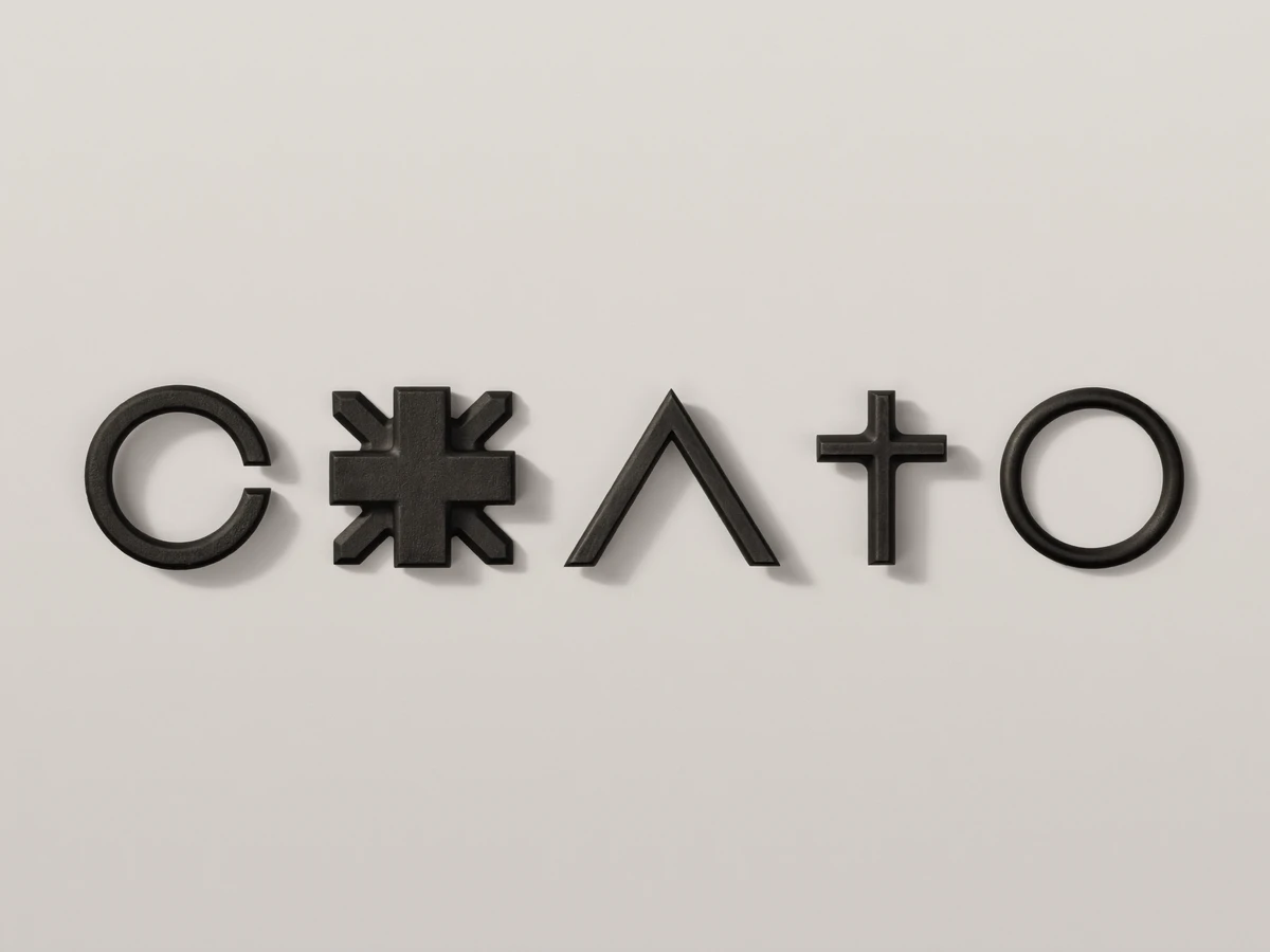
Black 3D logotype letters on a light grey wall
Brand identity for a studio launch
Figure
figure and figcaption tags
Legal Rich Text

Classes used inside the Legals CMS content: legal-heading, legal-text, legal-list, legal-list-item and legal-strong. Keep this card: it stops Clean Up from removing classes that only live in CMS content.

Spacing and radius.

Every gap, padding and corner comes from these. The values that shrink on smaller screens do so through variable modes, so nothing is ever set per breakpoint.

Layout Gap

Ten steps for every gap on the site. 2X Large, 3X Large and 4X Large shrink on smaller screens.

3X Small
0.3125rem · 5px
2X Small
0.4375rem · 7px
Extra Small
0.625rem · 10px
Small
0.9375rem · 15px
Medium
1.25rem · 20px
Large
1.5625rem · 25px
Extra Large
2.5rem · 40px
2X Large
3.125rem · 50 → 40 → 40px
3X Large
3.75rem · 60 → 40 → 40px
4X Large
6.25rem · 100 → 48 → 40px
Structure

The container width and the padding of every section. The dashed lines sit on the section and container edges.

Container Max Width
87.5rem · 1400px
Container Horizontal
40 → 40 → 15px
Section Horizontal
40 → 25 → 10px
Section Vertical
100 → 100 → 80px
Section Page Top
9.375rem · 150px
Radius

Eight corner sizes. Round is a large fixed value, so pills stay pills at any height.

Extra Small
0.5rem · 8px
Small
0.625rem · 10px
Icon
0.75rem · 12px
Medium
0.9375rem · 15px
Nested
1.125rem · 18px
Large
1.25rem · 20px
Extra Large
1.5625rem · 25px
Round
100rem

One component, one hover.

Every button is the Button component with four variants. On hover the brand color fills in from the bottom while the label and arrow roll up, in one IX3 timeline that reverses on hover out. The form buttons and social icons use the same motion.

Primary
Button · default variant
Secondary
Button · light fill with border
Text
Button · label with round arrow
Block
Button · full width, no arrow
Nav Link
Nav Link · text roll on hover
Back Link
Back Link · brand fill and sliding arrow

Two icon sets, one line weight.

Service, process, benefit, contact and social icons are Phosphor Icons. The arrow in buttons and cards is from Feather Icons. Both are MIT licensed SVGs. Icons that sit on dark cards carry a light layer that fades in with the card.

Icon Box
Process and benefit cards · 20px icon
Services Icon
Services list · 20px icon
Pricing Card Icon
Pricing cards · 20px icon
Checks
Services and pricing lists · 18px
Rating and Quote
Reviews · 16px star, 40px quote
Social Icon
Social Icon component · brand fill and icon roll